/*
Deckle's look, shared by every page: the website (index, companion, letters,
make, install, privacy) and the app (app.html). Pages add their own layout;
colours, type, buttons and the drawn X3 come from here, so the product reads
as one thing.
Direction: clean and minimal, easy on the eyes. Large bold type (Recoleta),
a soft paper ground rather than white, near-black ink, one quiet green for
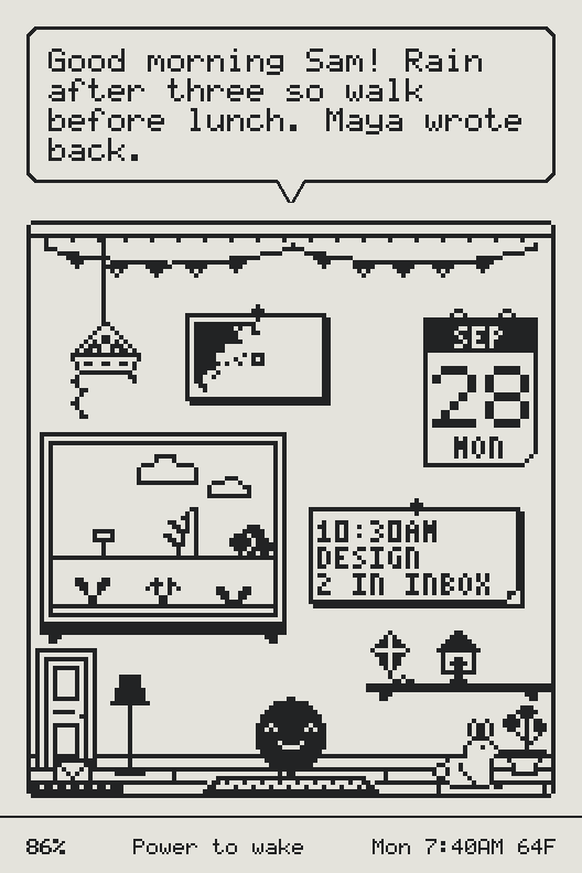
links and small highlights. The imagery is the device's own screens, drawn
by its renderer (tools/build_shots.mjs), and the pixel companion.
*/
@font-face {
font-family: "Recoleta";
src: url("/fonts/recoleta-medium.woff2") format("woff2"), url("/fonts/recoleta-medium.woff") format("woff");
font-weight: 500;
font-style: normal;
font-display: swap;
}
@font-face {
font-family: "Recoleta";
src: url("/fonts/recoleta-bold.woff2") format("woff2"), url("/fonts/recoleta-bold.woff") format("woff");
font-weight: 700;
font-style: normal;
font-display: swap;
}
/* Body text: Figtree (SIL OFL, fonts/figtree-OFL.txt), self-hosted, so no
page makes a third-party font request. */
@font-face {
font-family: "Figtree";
src: url("/fonts/figtree-latin.woff2") format("woff2");
font-weight: 300 900;
font-style: normal;
font-display: swap;
}
@font-face {
font-family: "Figtree";
src: url("/fonts/figtree-italic-latin.woff2") format("woff2");
font-weight: 300 900;
font-style: italic;
font-display: swap;
}
:root {
--paper: #f5f5f1; /* the page: soft, never pure white */
--surface: #ffffff; /* raised things: cards, inputs, the app's panels */
--surface-2: #efefea; /* wells, quiet fills */
--ink: #141414; /* headlines, primary buttons */
--ink-2: #3f4145; /* body text */
--ink-3: #676a6f; /* secondary text, captions (5:1 on the paper) */
--rule: #e2e2dc; /* hairlines */
--rule-2: #d3d3cc; /* quiet outlines (not for inputs) */
--field: #8a8d91; /* input and checkbox borders: 3:1 against white and paper */
--accent: #2c6a55; /* links, focus, small highlights; used sparingly */
--accent-soft: #e2ede7;
--warn: #9a4a16;
--warn-soft: #f6e9df;
--good: #2c6a55;
--stage: #ecebe5; /* a full-bleed showcase band behind devices */
--eink-paper: #e4e3dc; /* the panel itself, as in the shots */
--eink-ink: #222324;
--display: "Recoleta", "Iowan Old Style", "Palatino Linotype", Georgia, serif;
--text: "Figtree", ui-sans-serif, system-ui, -apple-system, "Segoe UI", Roboto, sans-serif;
--mono: ui-monospace, "SF Mono", Menlo, Consolas, monospace;
/* Type scale: big and bold at the top, calm below. */
--t-hero: clamp(3rem, 1.6rem + 6.2vw, 6.75rem);
--t-1: clamp(2.4rem, 1.5rem + 3.6vw, 4.25rem);
--t-2: clamp(1.75rem, 1.3rem + 1.8vw, 2.6rem);
--t-3: clamp(1.3rem, 1.15rem + 0.6vw, 1.6rem);
--t-lede: clamp(1.15rem, 1.05rem + 0.45vw, 1.4rem);
--t-body: 1.0625rem;
--t-small: 0.9375rem;
--t-tiny: 0.8125rem;
--gutter: clamp(20px, 5vw, 48px);
--max: 1180px;
--section: clamp(88px, 11vw, 160px);
--radius: 18px;
--radius-sm: 12px;
--shadow-1: 0 1px 2px rgba(20, 20, 20, 0.04), 0 2px 8px rgba(20, 20, 20, 0.04);
--shadow-2: 0 2px 6px rgba(20, 20, 20, 0.05), 0 18px 40px -18px rgba(20, 20, 20, 0.18);
/* The drawn X3 */
--x3-body-hi: #fbfbf8;
--x3-body-lo: #e7e7e1;
--x3-edge: rgba(20, 20, 20, 0.1);
--x3-key: #dcdcd5;
--x3-shadow: rgba(24, 24, 20, 0.28);
color-scheme: light;
}
@media (prefers-color-scheme: dark) {
:root:not([data-theme="light"]) {
--paper: #121314;
--surface: #1a1b1d;
--surface-2: #202124;
--ink: #f3f3ef;
--ink-2: #c9cac5;
--ink-3: #8f9195;
--rule: #2a2c2f;
--rule-2: #36383c;
--field: #6b6e73;
--accent: #8ccab2;
--accent-soft: #1d2a25;
--warn: #e3a36f;
--warn-soft: #2d231b;
--good: #8ccab2;
--stage: #1b1c1f;
--shadow-1: 0 1px 2px rgba(0, 0, 0, 0.3);
--shadow-2: 0 18px 40px -18px rgba(0, 0, 0, 0.6);
--x3-body-hi: #3a3b3e;
--x3-body-lo: #242528;
--x3-edge: rgba(255, 255, 255, 0.08);
--x3-key: #2f3033;
--x3-shadow: rgba(0, 0, 0, 0.55);
color-scheme: dark;
}
}
:root[data-theme="dark"] {
--paper: #121314;
--surface: #1a1b1d;
--surface-2: #202124;
--ink: #f3f3ef;
--ink-2: #c9cac5;
--ink-3: #8f9195;
--rule: #2a2c2f;
--rule-2: #36383c;
--field: #6b6e73;
--accent: #8ccab2;
--accent-soft: #1d2a25;
--warn: #e3a36f;
--warn-soft: #2d231b;
--good: #8ccab2;
--stage: #1b1c1f;
--shadow-1: 0 1px 2px rgba(0, 0, 0, 0.3);
--shadow-2: 0 18px 40px -18px rgba(0, 0, 0, 0.6);
--x3-body-hi: #3a3b3e;
--x3-body-lo: #242528;
--x3-edge: rgba(255, 255, 255, 0.08);
--x3-key: #2f3033;
--x3-shadow: rgba(0, 0, 0, 0.55);
color-scheme: dark;
}
/* ------------------------------------------------------------------ base */
*,
*::before,
*::after {
box-sizing: border-box;
}
html {
-webkit-text-size-adjust: 100%;
text-rendering: optimizeLegibility;
}
body {
margin: 0;
background: var(--paper);
color: var(--ink-2);
font: 400 var(--t-body) / 1.65 var(--text);
-webkit-font-smoothing: antialiased;
-moz-osx-font-smoothing: grayscale;
}
img,
svg {
max-width: 100%;
display: block;
}
a {
color: var(--accent);
text-decoration-thickness: 1px;
text-underline-offset: 0.18em;
}
a:hover {
text-decoration-thickness: 2px;
}
:focus-visible {
outline: 2px solid var(--accent);
outline-offset: 3px;
border-radius: 6px;
}
::selection {
background: var(--accent-soft);
color: var(--ink);
}
[hidden] {
display: none !important;
}
figure {
margin: 0;
}
h1,
h2,
h3,
.display {
line-height: 1.15;
font-family: var(--display);
color: var(--ink);
font-weight: 700;
letter-spacing: -0.015em;
text-wrap: balance;
margin: 0;
}
.t-hero {
font-size: var(--t-hero);
line-height: 0.98;
letter-spacing: -0.025em;
}
.t-1 {
font-size: var(--t-1);
line-height: 1.02;
}
.t-2 {
font-size: var(--t-2);
line-height: 1.08;
}
.t-3 {
font-size: var(--t-3);
line-height: 1.2;
font-weight: 500;
}
.lede {
font-size: var(--t-lede);
line-height: 1.55;
color: var(--ink-2);
max-width: 36em;
text-wrap: pretty;
}
.muted {
color: var(--ink-3);
}
p {
margin: 0 0 1em;
text-wrap: pretty;
}
.wrap {
max-width: var(--max);
margin-inline: auto;
padding-inline: var(--gutter);
}
.stack > * + * {
margin-top: var(--gap, 1rem);
}
.vh {
position: absolute !important;
width: 1px;
height: 1px;
overflow: hidden;
clip: rect(0 0 0 0);
white-space: nowrap;
}
/* ------------------------------------------------------------------ buttons */
.btn {
--b-bg: var(--ink);
--b-fg: var(--paper);
--b-bd: var(--ink);
display: inline-flex;
align-items: center;
justify-content: center;
gap: 0.5em;
min-height: 48px;
padding: 0 1.4em;
border-radius: 999px;
border: 2px solid var(--b-bd);
background: var(--b-bg);
color: var(--b-fg);
font: 600 1rem/1 var(--text);
text-decoration: none;
cursor: pointer;
transition: transform 0.15s ease, background-color 0.15s ease, border-color 0.15s ease, color 0.15s ease;
white-space: nowrap;
}
.btn:hover {
transform: translateY(-1px);
text-decoration: none;
}
.btn:active {
transform: translateY(0);
}
.btn[disabled],
.btn[aria-disabled="true"] {
opacity: 0.45;
cursor: default;
transform: none;
}
.btn-quiet {
--b-bg: transparent;
--b-fg: var(--ink);
--b-bd: var(--rule-2);
}
.btn-quiet:hover {
--b-bd: var(--ink);
}
.btn-accent {
--b-bg: var(--accent);
--b-fg: var(--paper);
--b-bd: var(--accent);
}
.btn-sm {
min-height: 38px;
padding: 0 1.05em;
font-size: 0.9375rem;
}
.btn-lg {
min-height: 56px;
padding: 0 1.8em;
font-size: 1.0625rem;
}
.link-arrow {
font-weight: 600;
color: var(--ink);
text-decoration: none;
display: inline-flex;
align-items: center;
gap: 0.35em;
}
.link-arrow::after {
content: "→";
transition: transform 0.15s ease;
}
.link-arrow:hover::after {
transform: translateX(3px);
}
/* ------------------------------------------------------------------ the X3
A drawn XTEINK X3 around a real screen:
Size it with --w set to one of the exact sizes below (--x3-sm, --x3-lg,
--x3-ph), never vw or clamp(): the screen is 88% of --w, and only these
land the panel's pixels on whole device pixels at 1x, 1.5x, 2x and 3x.
Everything inside is in units of --w, so it scales without distorting. .x3.x3-graphite draws the dark model; .x3.tilt
turns it a little in space. The four face keys sit under the screen; the
side keys and Power are drawn on the edges, as on the real device.
.x3.x4 draws the X4 instead (below).
*/
.x3 {
--w: 300px;
--u: calc(var(--w) / 100);
position: relative;
/* Always exactly --w wide: everything inside is drawn in units of --w, so a
device squeezed by max-width would stop matching its own insides. Size it
with --w (clamp() and min() are fine) instead. */
width: var(--w);
flex: none;
margin: 0;
aspect-ratio: 100 / 150;
border-radius: calc(var(--u) * 4);
background: linear-gradient(165deg, var(--x3-body-hi) 0%, var(--x3-body-lo) 100%);
box-shadow:
inset 0 0 0 1px var(--x3-edge),
inset 0 calc(var(--u) * 0.6) calc(var(--u) * 0.8) rgba(255, 255, 255, 0.55),
inset 0 calc(var(--u) * -0.8) calc(var(--u) * 1.6) rgba(0, 0, 0, 0.06),
0 calc(var(--u) * 2) calc(var(--u) * 4) calc(var(--u) * -2) var(--x3-shadow),
0 calc(var(--u) * 14) calc(var(--u) * 26) calc(var(--u) * -12) var(--x3-shadow);
padding: calc(var(--u) * 6) calc(var(--u) * 6) 0;
isolation: isolate;
}
/* The white model whatever the page's theme (.x3 follows the theme). */
.x3.x3-light {
--x3-body-hi: #fbfbf8;
--x3-body-lo: #e7e7e1;
--x3-edge: rgba(20, 20, 20, 0.1);
--x3-key: #dcdcd5;
--x3-shadow: rgba(24, 24, 20, 0.28);
}
/* On a dark page every X3 is the graphite model: a white one glares brighter
than its own (dimmed) screen, and one device per theme reads calmer. */
@media (prefers-color-scheme: dark) {
:root:not([data-theme="light"]) .x3.x3-light {
--x3-body-hi: #3a3b3e;
--x3-body-lo: #1f2022;
--x3-edge: rgba(255, 255, 255, 0.08);
--x3-key: #2d2e31;
--x3-shadow: rgba(0, 0, 0, 0.6);
}
}
:root[data-theme="dark"] .x3.x3-light {
--x3-body-hi: #3a3b3e;
--x3-body-lo: #1f2022;
--x3-edge: rgba(255, 255, 255, 0.08);
--x3-key: #2d2e31;
--x3-shadow: rgba(0, 0, 0, 0.6);
}
.x3.x3-graphite {
--x3-body-hi: #3a3b3e;
--x3-body-lo: #1f2022;
--x3-edge: rgba(255, 255, 255, 0.08);
--x3-key: #2d2e31;
}
/* side keys and Power */
.x3::before,
.x3::after {
content: "";
position: absolute;
background: var(--x3-body-lo);
box-shadow: inset 0 0 0 1px var(--x3-edge);
z-index: -1;
}
.x3::before {
/* left and right side keys, one element drawn twice with a shadow */
top: 34%;
left: calc(var(--u) * -0.9);
width: calc(var(--u) * 1.4);
height: 11%;
border-radius: calc(var(--u) * 0.8);
box-shadow: inset 0 0 0 1px var(--x3-edge), calc(var(--w) + var(--u) * 0.4) 0 0 0 var(--x3-body-lo);
}
.x3::after {
/* Power, on the top edge */
top: calc(var(--u) * -0.9);
right: 18%;
width: 13%;
height: calc(var(--u) * 1.4);
border-radius: calc(var(--u) * 0.8);
}
.x3-screen {
position: relative;
width: 100%;
aspect-ratio: 528 / 792;
border-radius: calc(var(--u) * 1.4);
overflow: hidden;
background: var(--eink-paper);
box-shadow:
inset 0 0 0 1px rgba(0, 0, 0, 0.14),
0 0 0 calc(var(--u) * 0.6) rgba(0, 0, 0, 0.035);
}
.x3-screen img,
.x3-screen canvas {
width: 100%;
height: 100%;
object-fit: cover;
}
/* E-ink gives off no light: on a dark page a bright panel glares, so it is
shown a little dimmer, as it would look in a dim room. */
@media (prefers-color-scheme: dark) {
:root:not([data-theme="light"]) .x3-screen {
filter: brightness(0.84);
}
}
:root[data-theme="dark"] .x3-screen {
filter: brightness(0.84);
}
/* a faint sheen: glass over paper */
.x3-screen::after {
content: "";
position: absolute;
inset: 0;
background: linear-gradient(125deg, rgba(255, 255, 255, 0.16) 0%, rgba(255, 255, 255, 0) 38%),
radial-gradient(120% 80% at 50% 0%, rgba(255, 255, 255, 0.06), transparent 60%);
pointer-events: none;
box-shadow: inset 0 calc(var(--u) * 0.8) calc(var(--u) * 1.6) rgba(0, 0, 0, 0.08);
}
/* the four face keys, drawn under the screen */
.x3 {
background-image:
radial-gradient(closest-side, var(--x3-key) 97%, transparent 100%),
radial-gradient(closest-side, var(--x3-key) 97%, transparent 100%),
radial-gradient(closest-side, var(--x3-key) 97%, transparent 100%),
radial-gradient(closest-side, var(--x3-key) 97%, transparent 100%),
linear-gradient(165deg, var(--x3-body-hi) 0%, var(--x3-body-lo) 100%);
background-size:
16% 2.6%,
16% 2.6%,
16% 2.6%,
16% 2.6%,
100% 100%;
background-position:
13% 95.2%,
37.7% 95.2%,
62.3% 95.2%,
87% 95.2%,
0 0;
background-repeat: no-repeat;
}
/* The X4: the same drawing, taller and with wider bezels, around its 480 x 800
panel. Add .x4 to the figure, or data-model="x4" to anything around it (the
app puts it on for an X4 owner). The screen is 80% of the device,
10u of bezel each side, so the exact sizes below land the X4's 480 pixels
on whole device pixels too: 300px has a 240px screen, exact at 2x. The face
keys sit in the middle of its deeper chin. */
.x3.x4,
[data-model="x4"] .x3 {
aspect-ratio: 100 / 165;
padding: calc(var(--u) * 10) calc(var(--u) * 10) 0;
background-size:
16% 2.36%,
16% 2.36%,
16% 2.36%,
16% 2.36%,
100% 100%;
background-position:
13% 94.5%,
37.7% 94.5%,
62.3% 94.5%,
87% 94.5%,
0 0;
}
.x3.x4 .x3-screen,
[data-model="x4"] .x3 .x3-screen {
aspect-ratio: 480 / 800;
}
.x3.tilt {
transform: perspective(1800px) rotateY(-16deg) rotateX(5deg) rotateZ(1deg);
transform-style: preserve-3d;
}
.x3.tilt-left {
transform: perspective(1800px) rotateY(16deg) rotateX(5deg) rotateZ(-1deg);
}
@media (prefers-reduced-motion: no-preference) {
.x3.float {
animation: x3-float 7s ease-in-out 3;
}
@keyframes x3-float {
50% {
translate: 0 -8px;
}
}
}
/* The exact sizes. 300px has a 264px screen (half the panel: exact at 2x);
600px has 528 (exact at 1x); 400px has 352 (exact at 1.5x and 3x); 200px
has 176 (exact at 3x). */
:root {
--x3-sm: 300px;
--x3-lg: 600px;
--x3-ph: 300px;
}
@media (min-resolution: 1.5dppx) and (max-resolution: 1.99dppx), (-webkit-min-device-pixel-ratio: 1.5) and (-webkit-max-device-pixel-ratio: 1.99) {
:root {
--x3-lg: 400px;
}
}
@media (min-resolution: 2.5dppx), (-webkit-min-device-pixel-ratio: 2.5) {
:root {
--x3-sm: 200px;
--x3-ph: 400px;
}
}
@media (max-width: 359px) and (max-resolution: 2.49dppx) {
:root {
--x3-sm: 272px;
--x3-ph: 272px;
}
}
/* From 2x up every screen gets at least one device pixel per panel pixel, so
keep each one whole. (Below 2x smoothing a smaller screen is kinder than
dropping rows.) */
@media (min-resolution: 2dppx), (-webkit-min-device-pixel-ratio: 2) {
.x3 .x3-screen img,
.x3 .x3-screen canvas {
image-rendering: pixelated;
}
}
/* A close look at the panel's pixels: put a shot in, crop with --x/--y/--zoom. */
.pixels {
width: 100%;
min-width: 0;
--zoom: 3;
--x: 0%;
--y: 0%;
border-radius: var(--radius);
overflow: hidden;
background: var(--eink-paper);
box-shadow: inset 0 0 0 1px rgba(0, 0, 0, 0.08);
}
.pixels img {
width: calc(100% * var(--zoom));
max-width: none;
image-rendering: pixelated;
translate: calc(-1 * var(--x)) calc(-1 * var(--y));
}
/* Pixel companions (shots/looks/-.svg) scale crisply at any size. */
.sprite {
image-rendering: pixelated;
width: var(--s, 96px);
height: var(--s, 96px);
}
/* The svgs are drawn in e-ink ink; .adapt flips any of them on dark grounds. */
@media (prefers-color-scheme: dark) {
:root:not([data-theme="light"]) .adapt {
filter: invert(1) brightness(0.95);
}
}
:root[data-theme="dark"] .adapt {
filter: invert(1) brightness(0.95);
}
/* ------------------------------------------------------------------ small parts */
.card {
background: var(--surface);
border: 1px solid var(--rule);
border-radius: var(--radius);
box-shadow: var(--shadow-1);
}
.pill {
display: inline-flex;
align-items: center;
gap: 0.4em;
padding: 0.3em 0.8em;
border-radius: 999px;
background: var(--surface-2);
color: var(--ink-2);
font: 600 var(--t-tiny) / 1.3 var(--text);
}
.pill.good {
background: var(--accent-soft);
color: var(--accent);
}
.rule {
border: 0;
border-top: 1px solid var(--rule);
margin: 0;
}